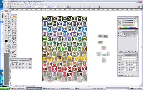
Plus eight or minus ten
Well, I have my initial answer for the quilt design:
Initial reaction: it's close. It's very close. I have eight stars left over, thus explaining the +8 or -10. If I want to stick with the current number of rows, I have eight spare stars. If I want to add one more row, which I believe I do, I'm ten short. Given that I'm sitting on several fabrics I didn't use, I'm fairly certain of my answer. I'd planned to be a bit short on stars for that very reason; I didn't pick out these fabrics, so I was going to be very dependent on lucking into a good order.
Two of those red fabrics just aren't playing nicely, though. I don't want to pull them out of the quilt; I'd rather blend them better. We'll see.
Full evolution of the design is documented at http://flickr.com/photos/domesticat/sets/72157613043153779/detail/


Comments
Oooooooh... so, so cool. I'd
Oooooooh... so, so cool. I'd vote for the +10 too, but then again I have an obsession with more squared-off shapes. LOVE IT either way.
I see exactly what you mean
I see exactly what you mean about it not quite coming together. Keep working at it, I like where this design is going!
I don't know if this will help you but maybe instead of thinking in terms of shades of color you could think in terms of contrast, or brightness, or saturation of colors. Maybe if you tackle the problem from a slightly different aspect than pure hue considerations? Maybe you're doing this already. I don't know if that's helpful; if it's not helpful to you then don't worry about it.
Also, I often find that if I can't get the color just right in a photo, I'll switch to black and white, make contrast adjustments until it looks good in black and white, and then switch back to color. Often times the color issues sort themselves out. Of course with a photo I'm not moving the tree to be next to the car to be next to the sky to be next to the person. I don't know how applicable this would be with your quilt design. Also this is all in lightroom and lightroom has a really good algorithm for doing automatic greyscale conversions; getting a good black and white is much more laborious in photoshop. At least it is for me, I've never quite gotten the hang of the channel mixer.